I initially boxed my idea of my self in to the two polarity's of being serious and silly as I felt it captured who I was.
 |
| Brainstorming serious words |
 |
| Brainstorming silly words and representations of serious words |


Being seriously silly reminded me of the myth of Sisyphus. (Sisyphus was sentenced to the forever meaningless turmoil of rolling a boulder up a hill everyday just to watch it roll down the next. )
Albert Camus has a great interpretation of the Myth I recommend all to read http://www.sccs.swarthmore.edu/users/00/pwillen1/lit/msysip.htm
So I tried to incorporate it into my name.


I then went back to playing around with absurdist ideas.


Next I decided to incorporate my interest in religions into the serious silly paradigm.
The idea was to create three trinity trees as my logo. Silliness came into this logo as I thought "Three trinity trees = 9"
The Symbolism being. The Christian trinity, The Father, the Son and the Holy Ghost are all God when together. But God is not the Father or the Son or the Holy Ghost but all three at once.


Personally I believe this to be the same with the soul of a person. The father being the mind. The son being the body and the holy ghost being ones emotions and empathy essentially spirit.
You are not your body your mind or your spirit but you are all three at once.
Three trinity trees = 9
"I" is the 9th letter of the alphabet
"I" is the first letter in my name "Ian"
"I" is the self
Three trinity trees = The self.
I wanted the roots from the tree to feed into my second name. To show my roots as a "Buckley"
My sisters name is Ruth which sounds like Root. My other sisters name is "Sophie" which means "wisdom" so I placed an apple of Eden on the trinity trees.
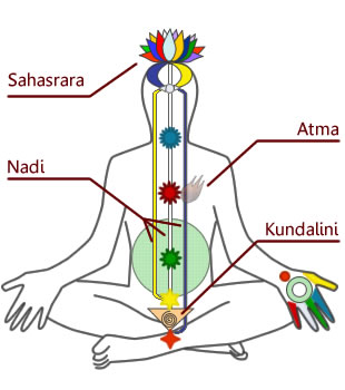
I decided to twist the barks of the trees around each other to further tie the logo to more symbolism. The symbolism in question is the caduceus. Which reminds me of a spinal cord and how Kundalini yoga talks about raising the energy up through the different chakra points to meet at the top of the spine in ones head.


Now that I had brain stormed multiple idea it was time for me to pick my top 3. These being the "Three trinity trees", the "Myth of Sisyphus" and the "Man in the suit"

It was at this point that it became clear that the logos I had produced failed to describe me as a person Back to brainstorming. and drawing out visual representations of my new ideas.


I explored the idea of the magic wand, as I'm an individual interested in the occult. I liked the trail behind the wand as it adds a feeling of energy and motion to the logo.


Enjoying the trailing curve left by the wand I began to experiment with other objects. Such as a torch and a dagger.
The torch to represent Lucifer the light bearer. As Lucifer is the brightest light in times of darkness e.g. The "a" is a pentagram in order to fit in with the theme of Lucifer as Lucifer is associated with the planet Venus and Venus at night is the next brightest thing after the moon and a man made satellite this is when viewed from the earth of course. Why is Venus associated with the pentagram you ask? Well Venus and Earths intersections in terms of the relationship of their orbits to one another produce a pentagonal pattern http://www.youtube.com/watch?v=4cgQNUhtmHM
The torch also represents the myth of the titan Prometheus. Who stole fire from the Gods.
I chose the dagger as a dagger is known as an instrument of a magician.


I planned a rough story board idea of how I might animate this logo. But I realised that ultimately these logo do not represent who I am but are in fact representations of what I enjoyed
So who am I? I begin to brainstorm again. I realise that I am an over thinker.


I try to come up with ways to represent overthinking in images.


I became rather intrigued with impossible shapes and how they puzzle the mind, I felt that an impossible shape would be the perfect vessel to contain myself. I begin to mess around with spelling my name using impossible shapes.


I brainstormed what type of audio and colour I would like to use for overthinking.


I thought about what I don't want my logo to be like.

I researched fonts choosing only fonts I felt might help my logo.


In Illustrator I furthered the development of my logo.
By mirroring a play on the impossible triangle 6 times one ends up with a hexagonal structure made up of impossible triangles. I played around with various combinations.


I managed to widdle down my fonts to a selection of 3. In the end I favoured the font "Trajan Pro".


I decided upon my final logo. As desired it is a puzzle to comprehend. To me it is many things. The main things it strikes me as are two half's of the brain and an iris. For this reason I feel my logo represents the minds eye primarily. There's a confusion of perspective going on within the logo too. if you stare at the logo it seems although three parts are coming forward and three parts are in the background stare for long enough though and the roles reverse. The three in the background enter the foreground and the three in the foreground enter the background. A cube can also be seen in the logo but its hard to make out.

Now it was time to plan my animation. In order to come up with ideas I brainstormed what my logo reminded me of.

I made storyboards to explore what I wanted my animation to be about.


I made a story board I was happy with.

As my logo has an eighties vibe to it. I was recommended to watch " Beyond the Black Rainbow " for both its music and visuals. I loved the movie and felt the song "Sentionauts" by Jeremy Schmidt was very powerful and decided to use it for my animation.
Initially I made the animation without the eye just to help me learn how to do what I wanted to do in After Effects.
Next I made the piece based off of the story board. Now with audio. The eye is present yet it seems out of place it movement is unnatural. The tempo of the piece is slow and boring especially without audio. I was dissatisfied with my idea.
From the dissatisfaction it was time to tinker around in after effects. I decided to repeat the video on different layers at different times resulting in the following effect that I was very happy with,.
While messing around with echoing the images visually I decided to play with rotation in 3d space resulting in the following experiment.
I found this even more interesting, So I decided that this would be the method my logo came together.
Now here is my final logo animation. I find it more interesting then my other animations and I like how the pieces make an eye around the logo at the 0:06 mark.
No comments:
Post a Comment